Visualizing My Photo Library
Note: Check out an interactive version of this post as an Observable notebook here.
My iCloud photo library keeps growing steadily. There are about 19,000 photos in there currently.
I wanted to make some sense of that data by visualizing my photo-taking habits. So let’s chart how and when I take photos.
Creating the Charts
The data comes from my iCloud photo library on my iPhone.
I wrote a Python script to export the data from my iPhone using the Pythonista app. You can find the script and the exported dataset here.
I used Vega-Lite to create the charts.
By Year and Month
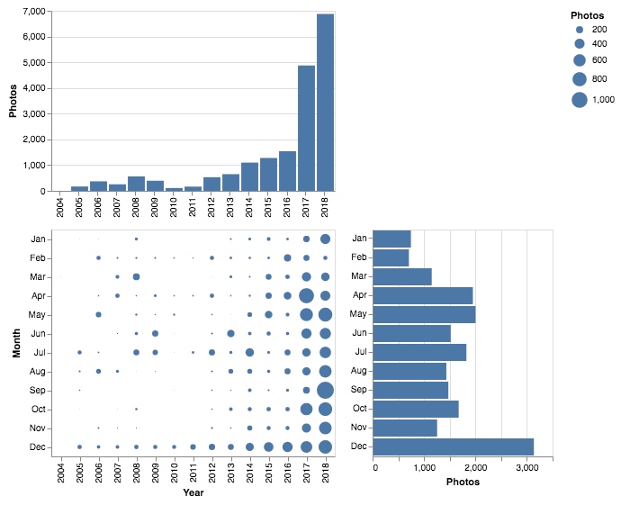
The chart at the top shows the number of photos I took each year. The trend clearly shows that I take more photos each year. While 2012 to 2016 saw moderate growth, there’s an explosion in 2017 and 2018.
I see a few reasons for this.
I take more photos in general, of course. But I also take different kinds of photos. I now take a lot of pictures of everday mundane things, like a visual diary. Decades down the road, I want to get a good feel of how my life was back then, i.e. today. For the same reason, I started asking friends and family to share their photos with me, adding to my library.
The bottom right chart shows photos by month. December is the clear winner and reflects the collected Christmas and New Year’s Eve photos from family. Apparently I don’t take many photos in January and February as I’m hibernating.
The chart on the bottom left combines both charts and gives photos per year and month. Christmas time each year is noticeable again (and increasing each year) but I also have yearly photos in April from my birthday.
By Weekday and Time of Day
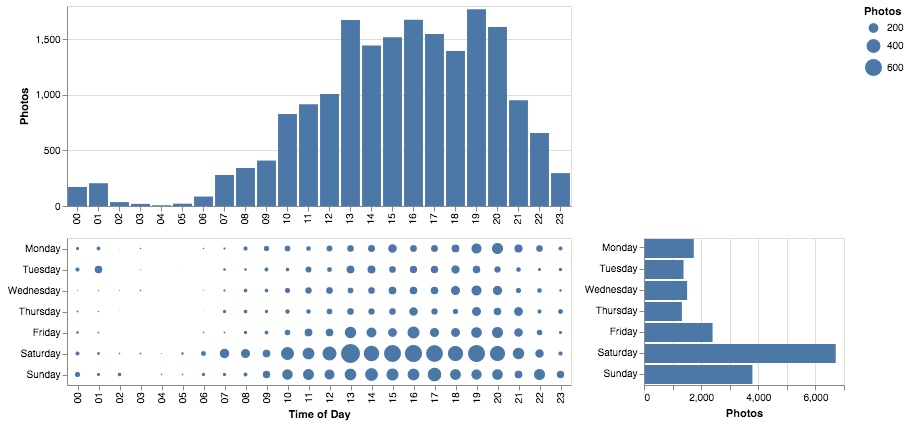
I was particularly interested in when I take most photos, i.e. which weekday or time of day. The bottom right chart clearly highlights Saturday as my photo day of choice. Makes sense since that’s when most exciting things happen. Friday and Sunday, too, stand out from the regular workdays.
The chart on the top shows at which time during the day I take most photos. It ramps up from late morning and peaks from early afternoon to evening. During nights I tend to sleep. Surprisingly, I’ve only ever managed to take six photos between four and five a.m.
Every Photo I Have Ever Taken
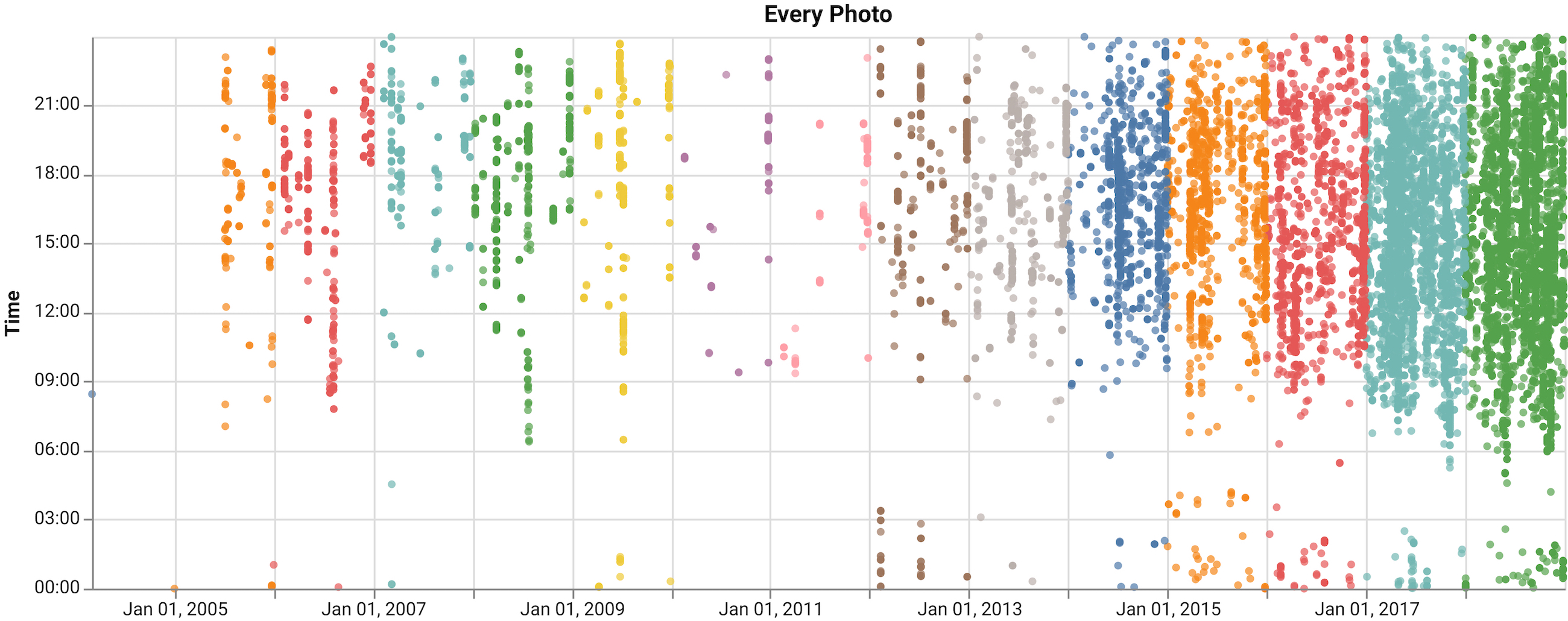
Here is one dot for every photo in my library. Again, you can see the increase in photo density over time.
Looking at this chart feels weirdly intimate. These are just dots—not even pictures—but they represent a lot of individual moments in my life. It gets even more intimate when we check what I’ve been up to on individual days:
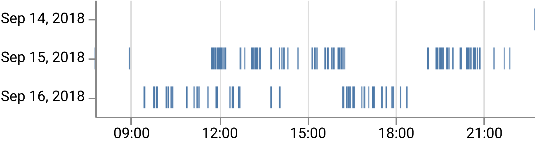
Just by looking at the photo pattern from my Berlin trip, I start to remember individual moments. Friday is empty as I was working late, then driving to Berlin and arriving at night. Saturday I explored the city. Sunday morning I watched the Berlin Marathon, in the afternoon I visited a friend.
Conclusion
It goes to show how much meaning there is in metadata alone. Here, I just looked at simple dates.
Photos usually include a geolocations as well. Mapping out photos by date and location could give me a reasonably detailed account on where I’ve been on any given day. Without even looking at the pictures directly, just metadata.